Paper choice can make a big difference

When it comes to creating stunning illustrations, choosing the right paper can make all the difference. The texture, color, and type of paper you use can significantly impact the outcome of your artwork. In this blog post, we'll delve into the world of paper and explore the various options available for different mediums such as watercolors, markers, and pencils.

Different Textures

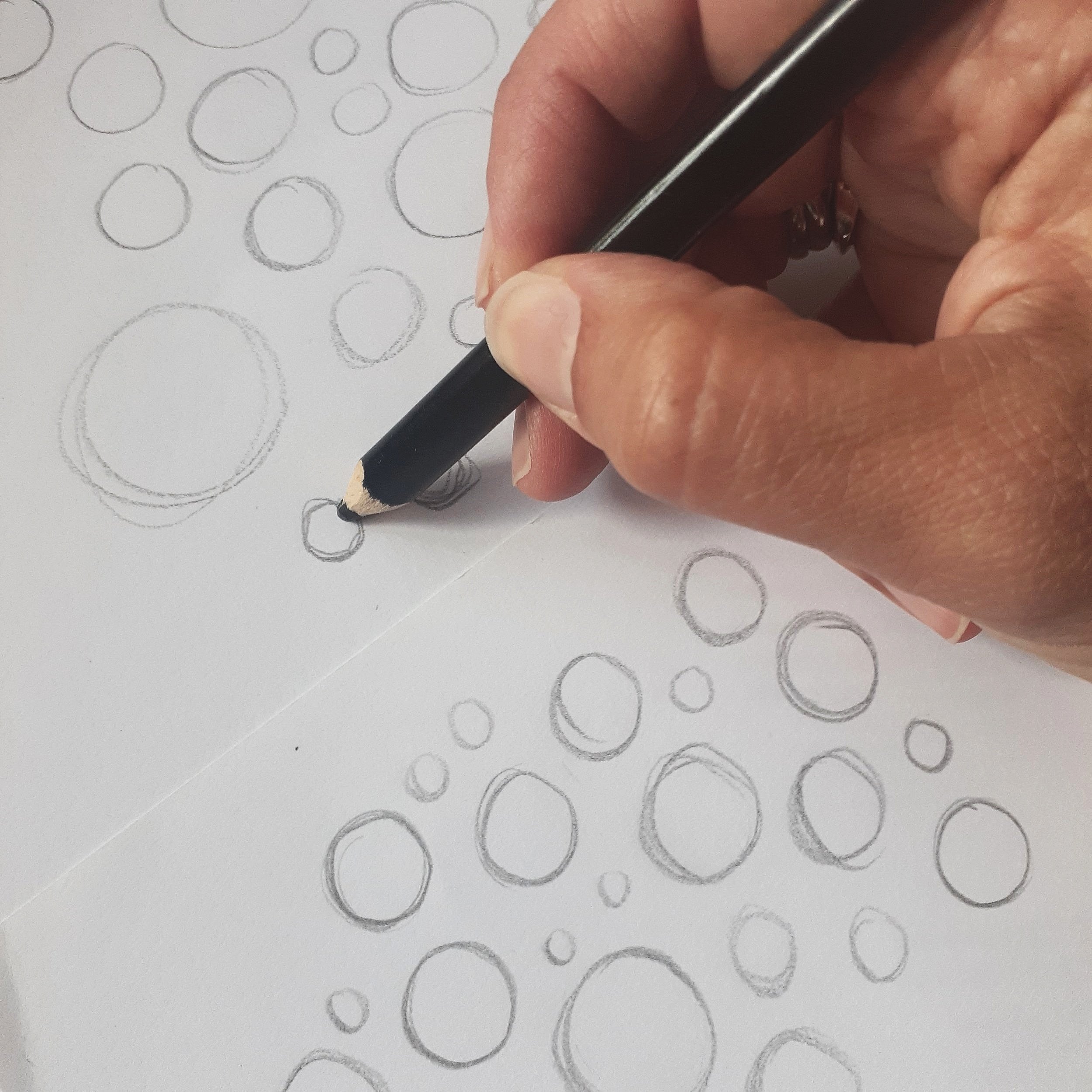
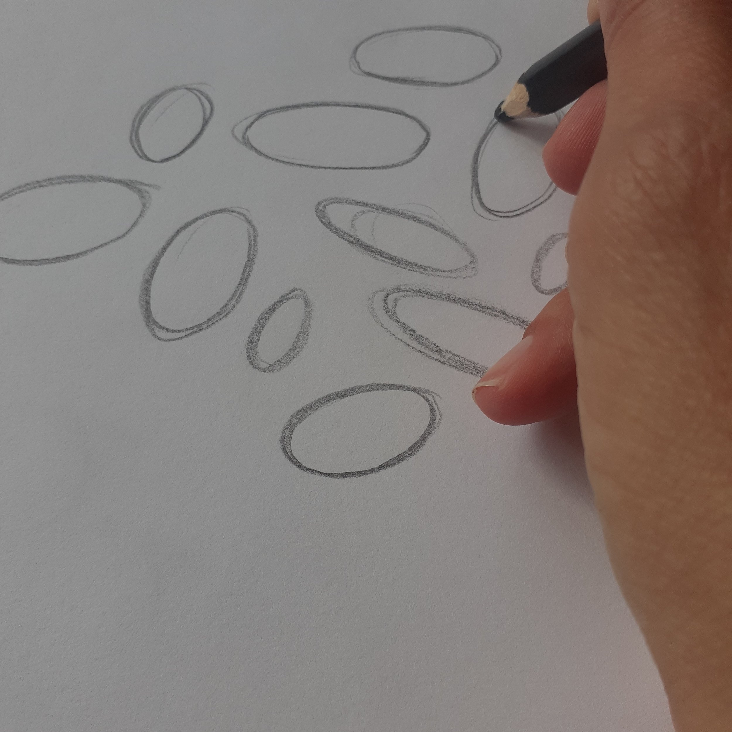
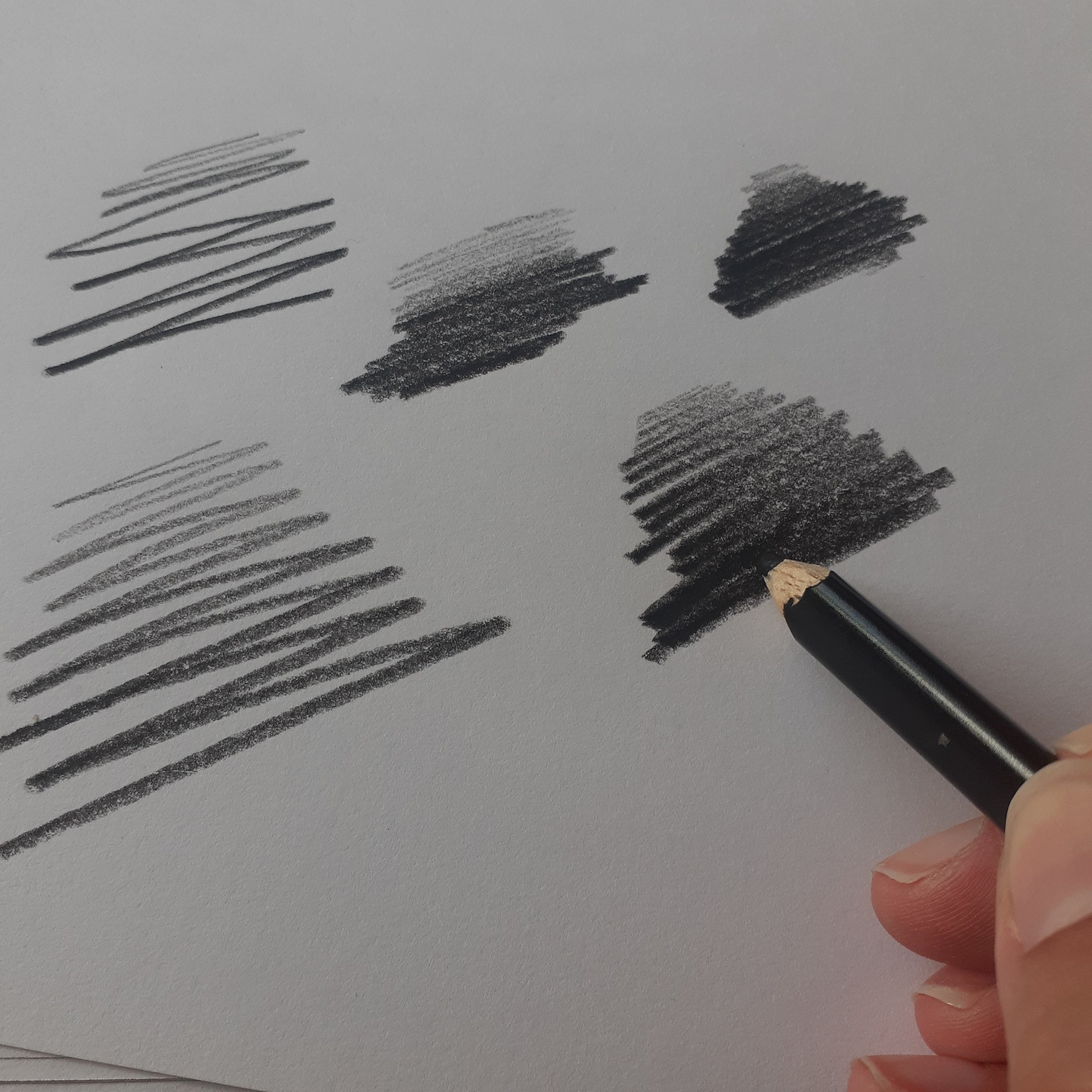
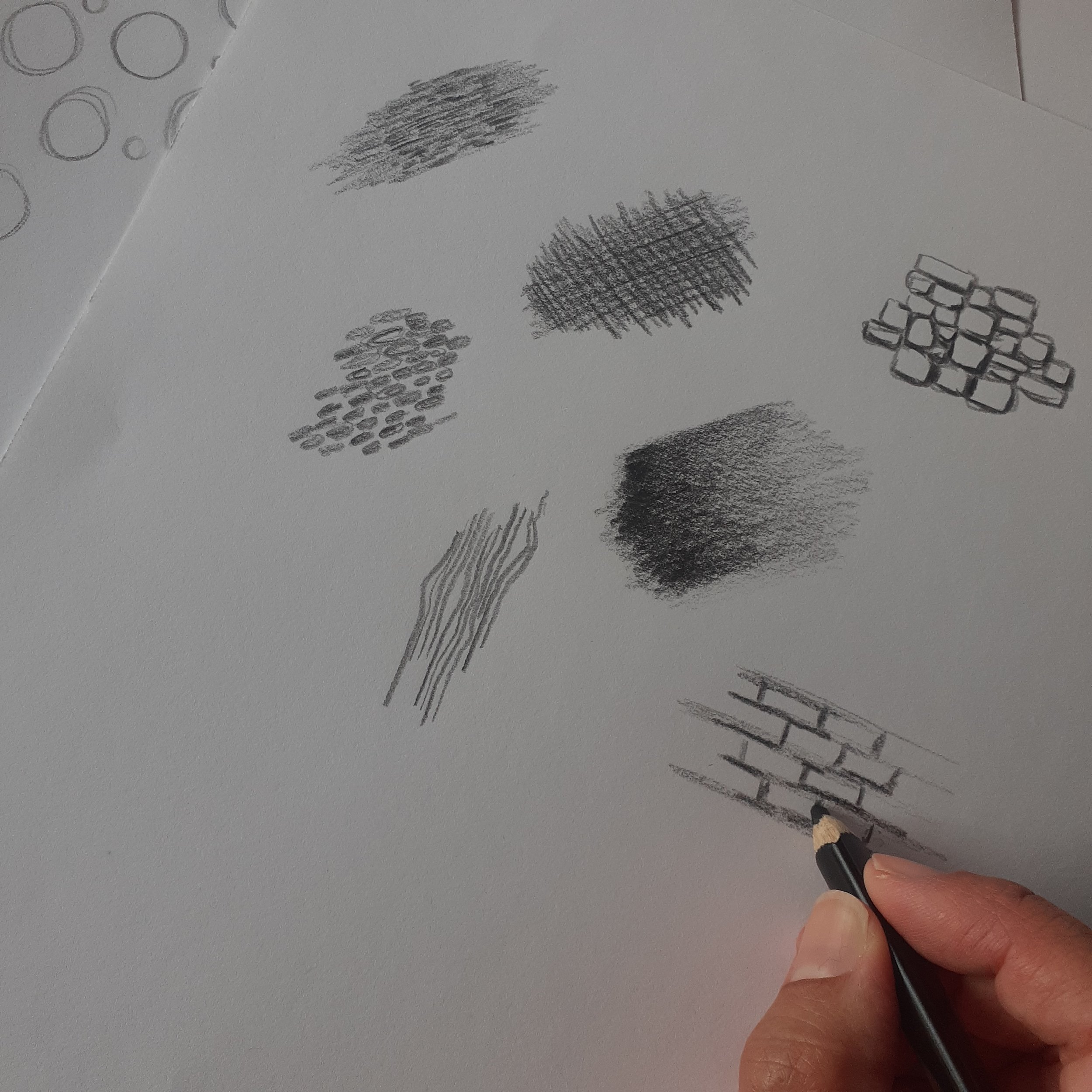
Texture plays a crucial role in how your illustrations will look and feel. Here are some common paper textures and their uses:

  1. Smooth Paper: Ideal for detailed work and fine lines, smooth paper is perfect for pen and ink illustrations. It provides a clean, sleek surface that allows for precise control over your medium.

  2. Hot Pressed Paper: This type of paper has a smooth, velvety finish and is excellent for watercolors. The smooth surface allows for even washes of color and fine detail work.

  3. Cold Pressed Paper: Also known as NOT paper (Not Hot Pressed), cold pressed paper has a slightly textured surface. It's versatile and can be used for watercolors, as well as other mediums like acrylics and gouache. The texture adds depth and interest to your artwork.

  4. Rough Paper: With a highly textured surface, rough paper is perfect for creating bold, expressive illustrations. It's commonly used for watercolor paintings where the texture can enhance the visual appeal of the piece.

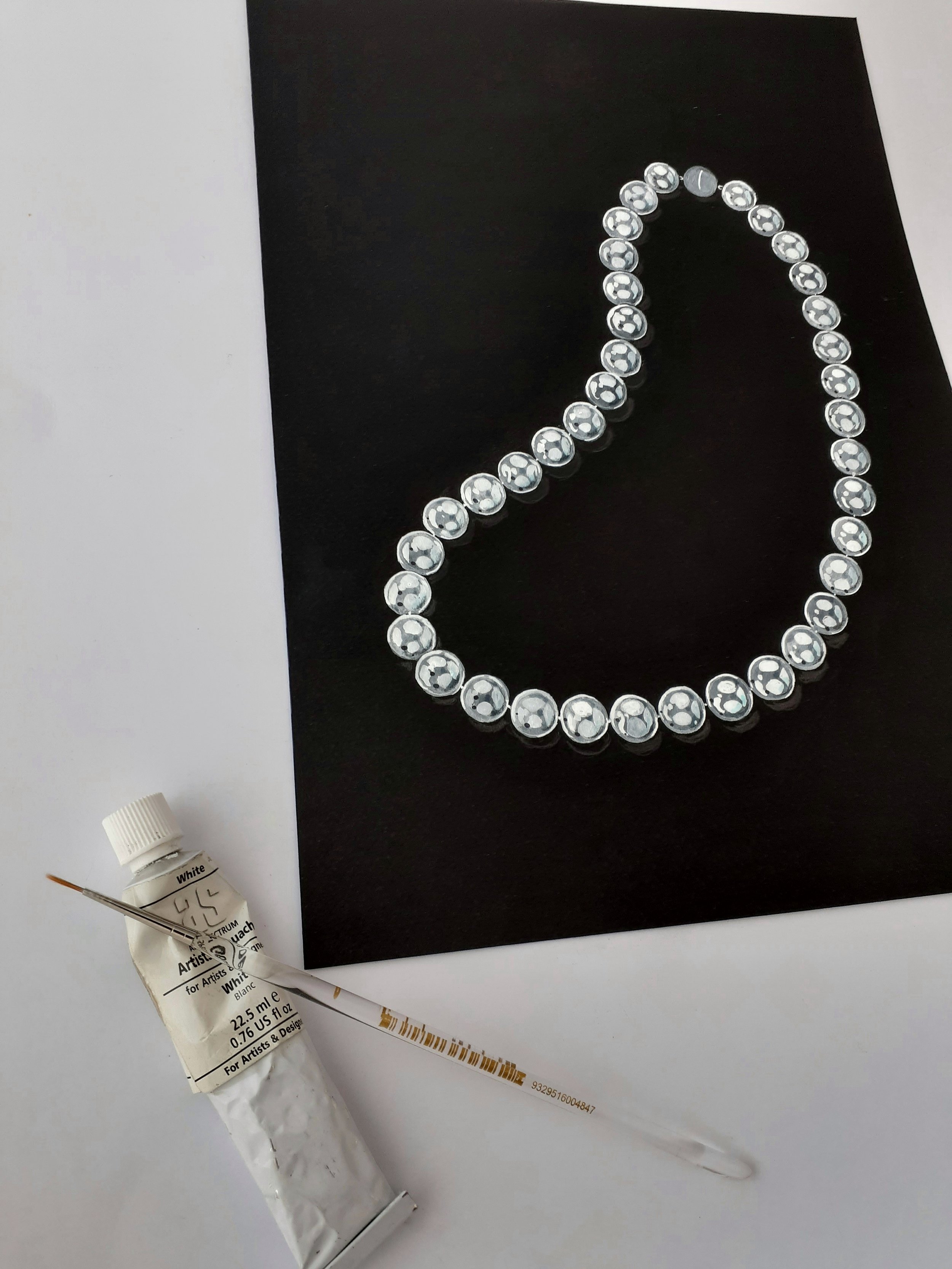
Contrast and Highlights: Colored paper allows you to play with contrasts. Light-colored or white pencils and markers stand out brilliantly on darker paper, creating striking highlights and adding depth to your illustration.


Color: Setting the Mood & Enhancing Contrast

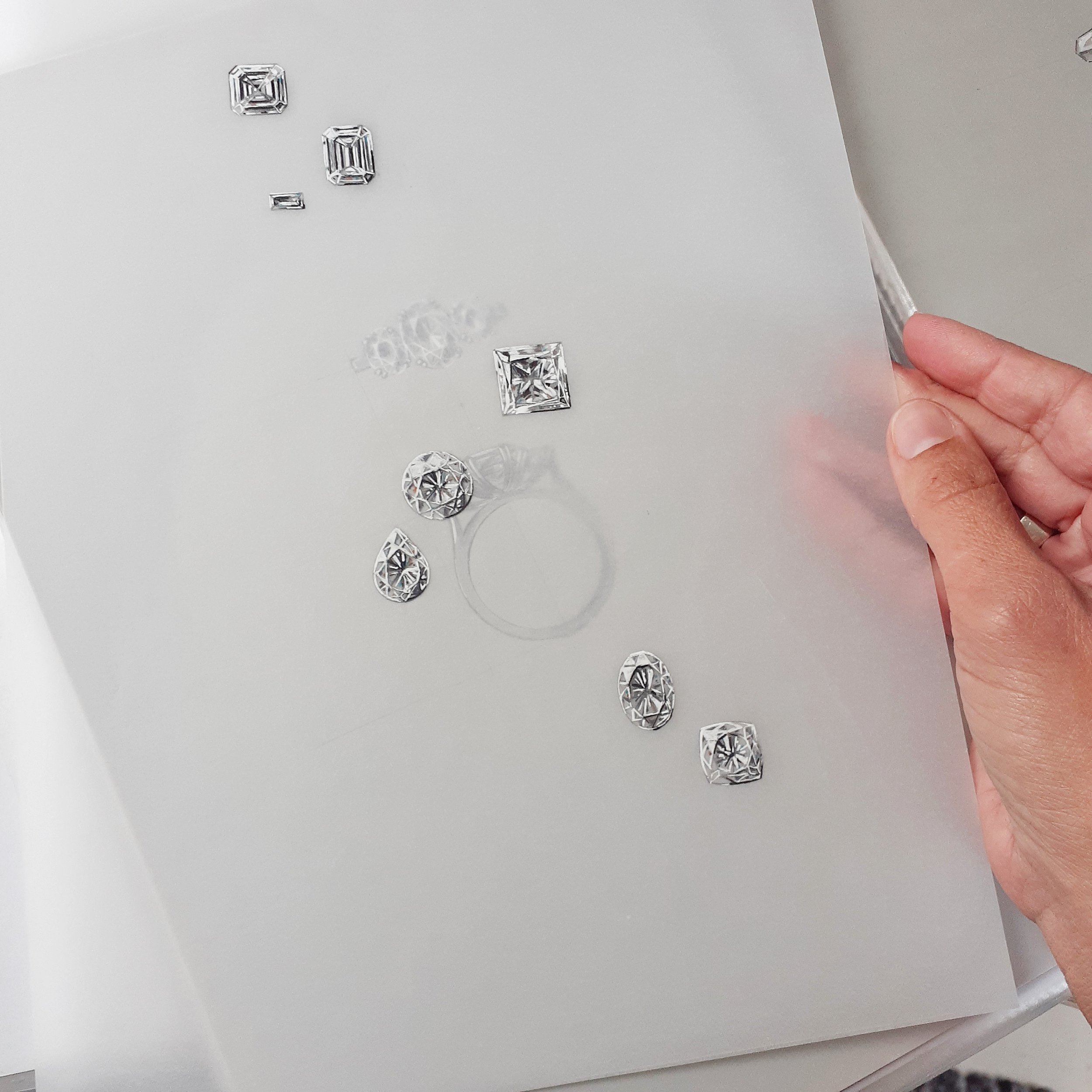
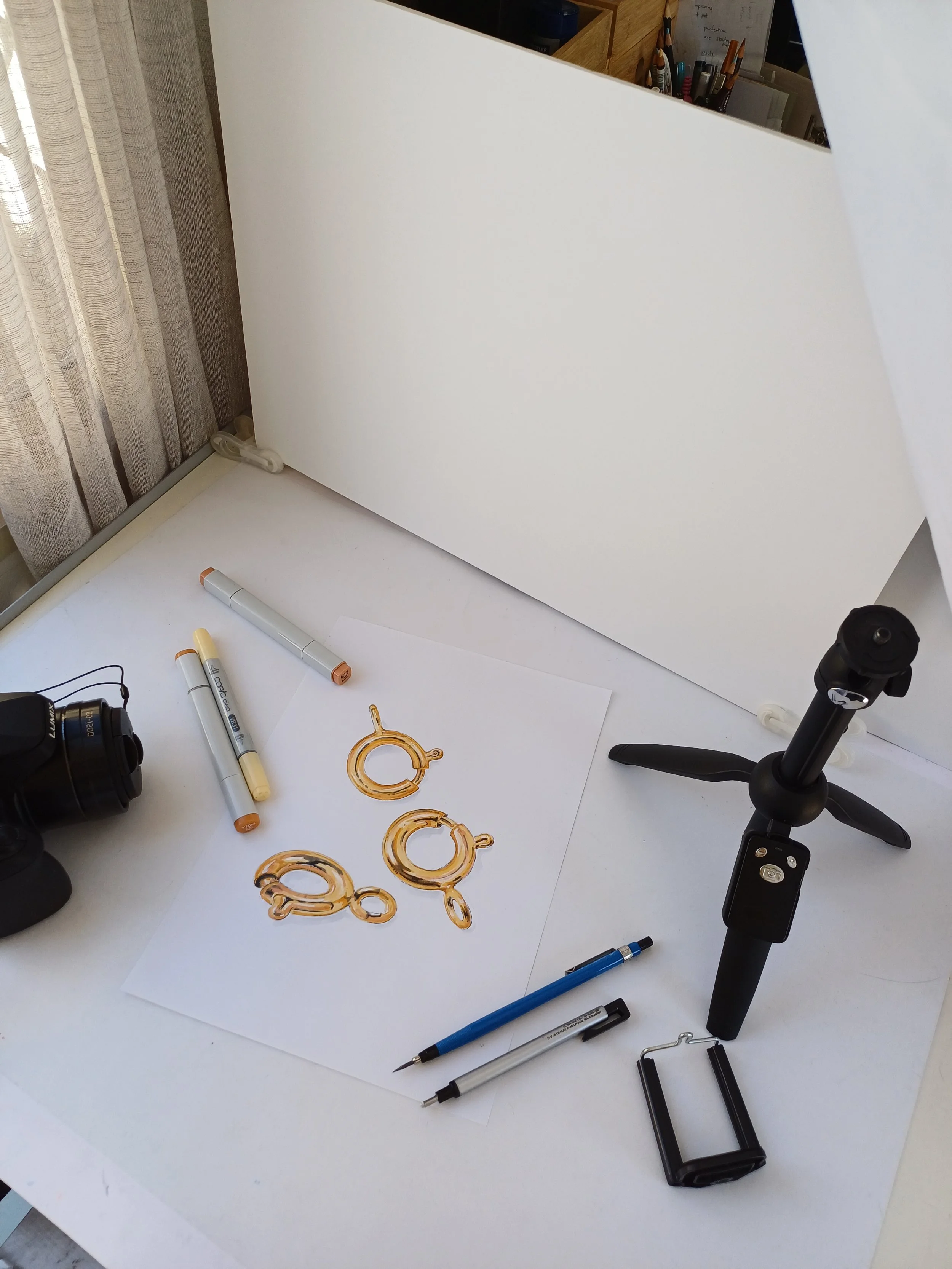
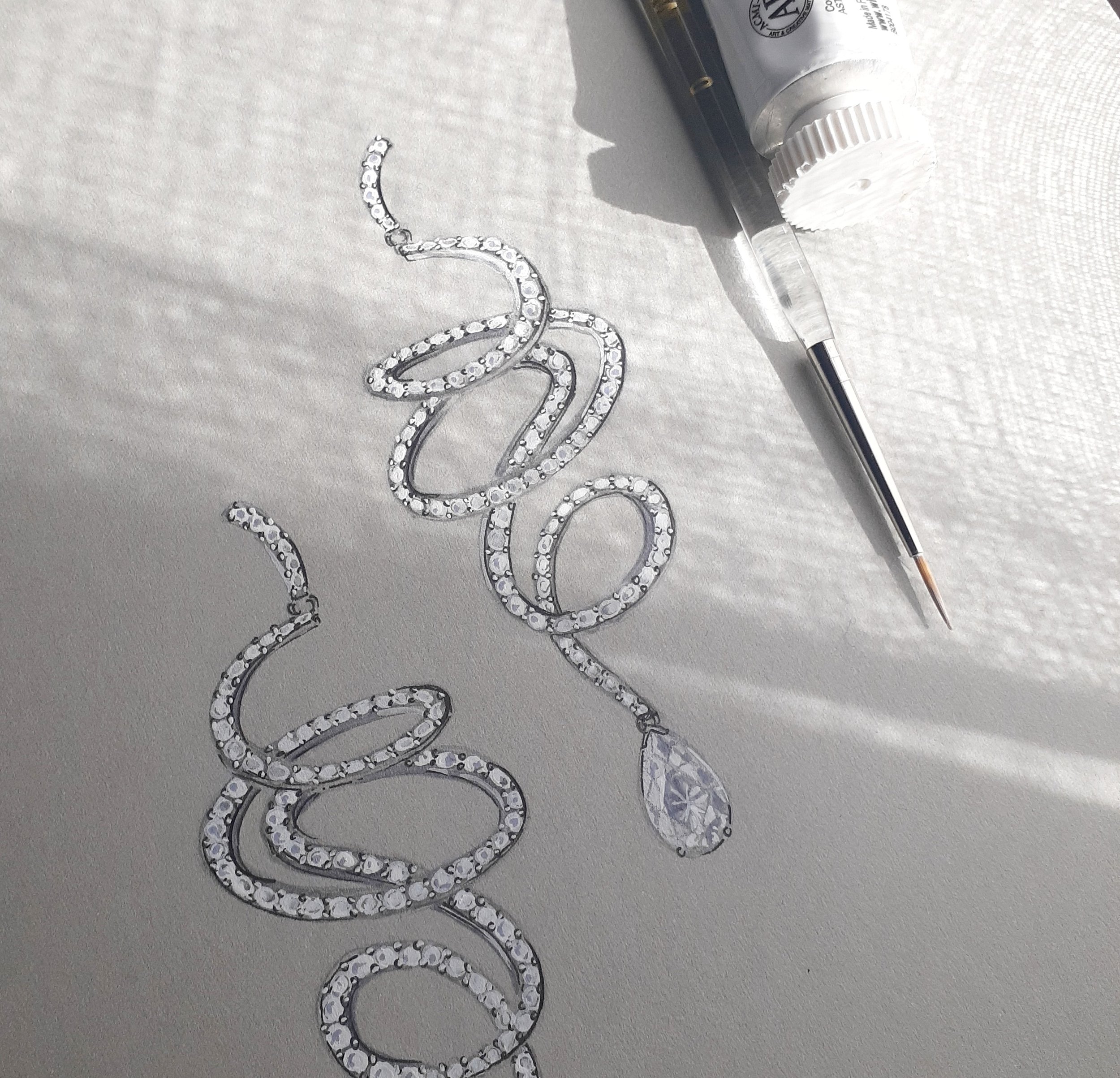
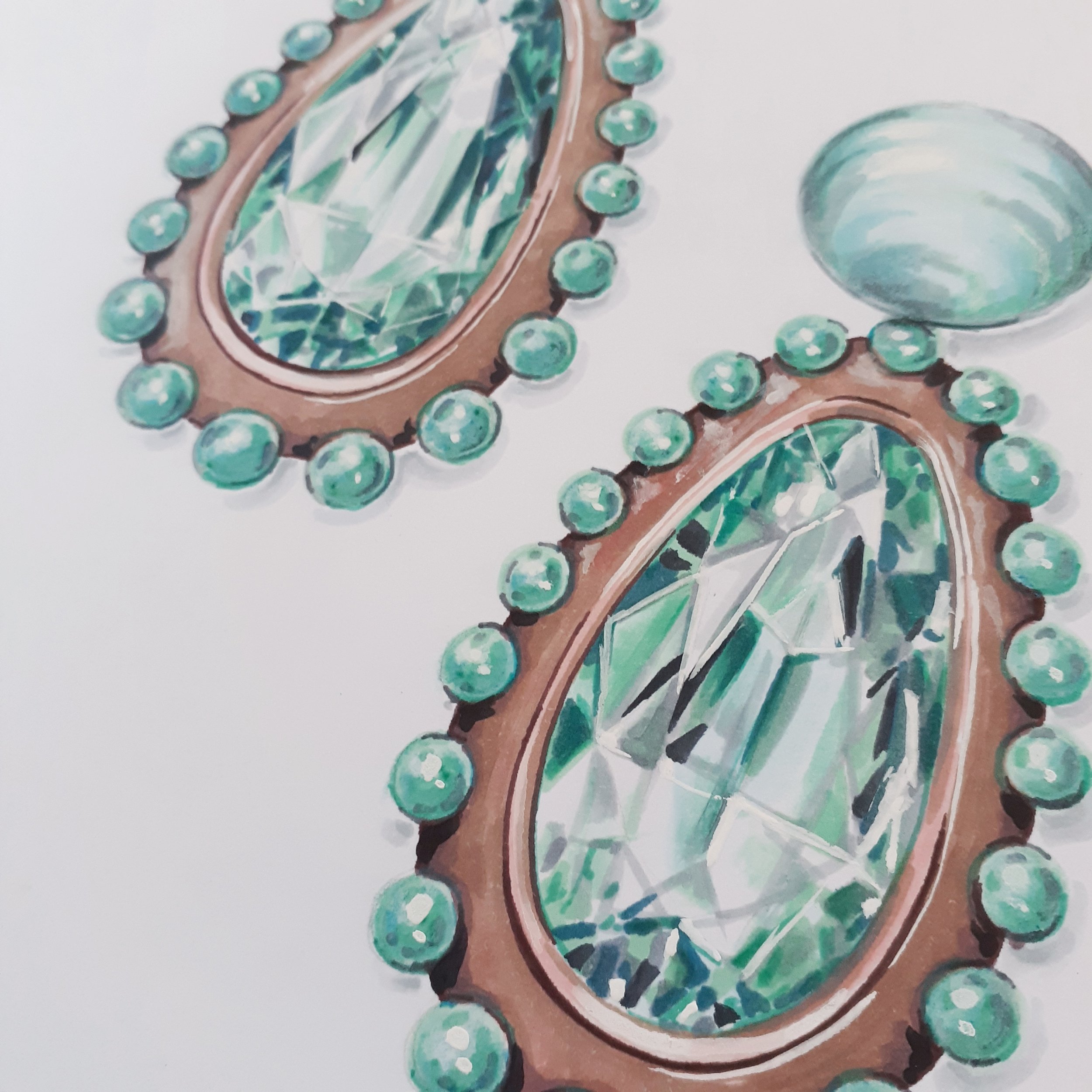
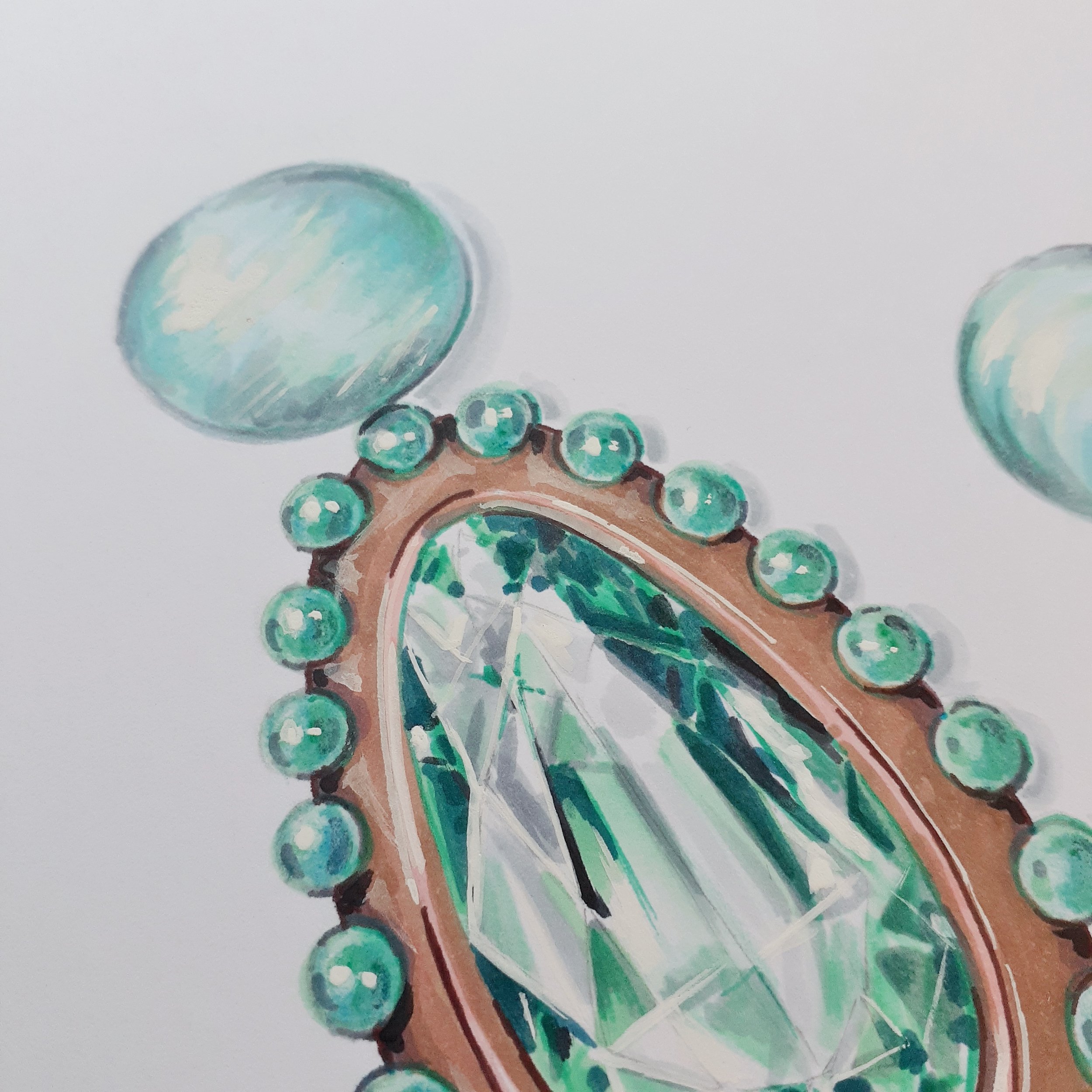
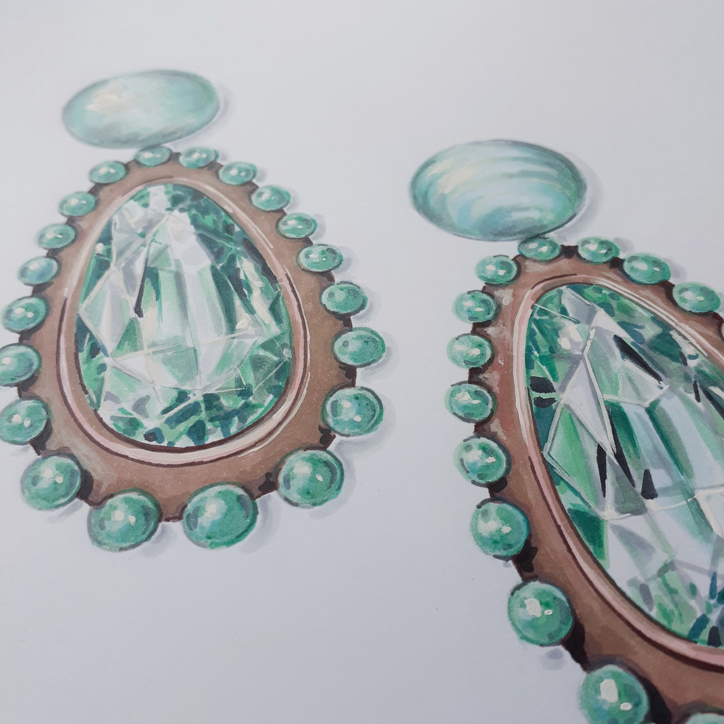
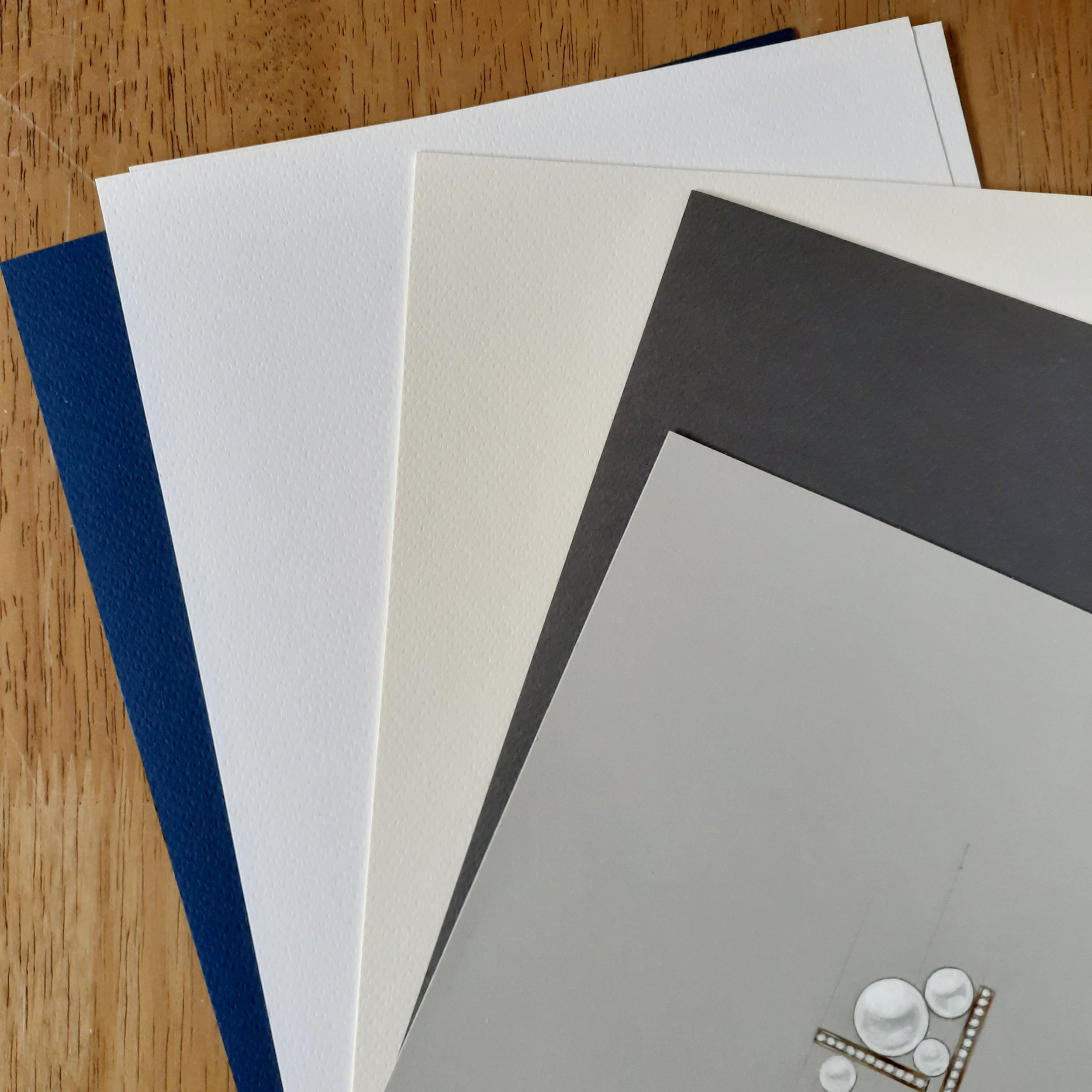
The color of the paper itself can influence the overall effect of a jewelry illustration. While traditional white paper is the default choice, experimenting with toned backgrounds can add drama and enhance metallics and gemstones.

  • White Paper: Classic choice for jewellery sketches, ensuring clarity and precision in technical drawings.

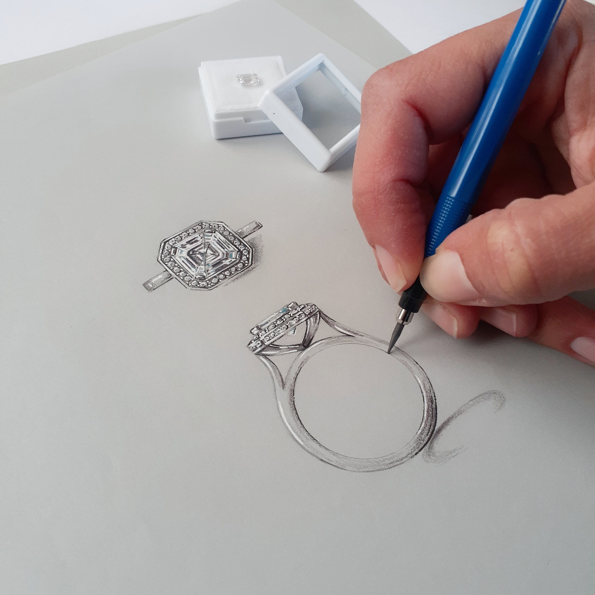
  • Gray/Toned Paper: Provides built-in mid-tones, allowing designers to use both highlights and shadows effectively. Great for creating depth in metalwork illustrations. Or great for mediusm such as gouache.

  • Black Paper: Creates striking contrast for white highlights, making diamonds and platinum settings pop. Perfect for pearls and white diamonds.

The right paper can transform jewellery concepts from rough ideas into polished illustrations. By understanding how texture, color, and paper type influence design work, jewellrey artists can experiment freely and bring their visions to life with greater depth and accuracy. Whether creating high-contrast gemstone studies, soft watercolor effects, or technical precision sketches, paper choice plays an essential role in the creative journey.

Vellum

A versatile alternative to add clever luxury to your design process.

Vellum is a translucent, smooth paper that has a delicate and elegant appearance. Traditionally, it was made from animal skin, but modern vellum is typically crafted from synthetic materials or high-quality cellulose fibers. It’s widely used in crafting, calligraphy, and design because of its unique texture and ability to diffuse light beautifully.

Artists use vellum for tracing, layering, and mixed-media projects. It’s often used for overlays in graphic design, adding a sophisticated touch to presentations and documents. Vellum can be incorporated into the jewellery design process in creative ways, adding depth and texture to designs.

Layered Sketching – Use vellum to create layered sketches, allowing you to build depth in your designs by stacking different elements on separate sheets.

Softened Color Effects – Apply watercolor or ink washes to vellum for a dreamy, diffused effect that enhances gemstone renderings.

Translucent Overlays – Overlay vellum on darker backgrounds to create a luminous effect, mimicking the glow of precious stones.

I also use Vellum in my jewellery design process to create interactive drawings for my clients to place over their hand and help with decision making. I draw gemstones in different shapes and colours on vellum so a client can explore initial directions without having to commit to a particular stone of size.

There are so many ways you can incorporate Vellum into your process to create interest and use as a helpful design tool to extend your client experience.

The Art of Keeping Mechanical Pencils Sharp: 0.3mm and 2mm

Mechanical pencils are a staple for artists, designers, and anyone who values precision in their work. Keeping your mechanical pencils sharp, whether they're 0.3mm or 2mm, is essential for maintaining clean, accurate lines and achieving the best possible results. In this blog post, we'll explore why it's important to keep your mechanical pencils sharp and the tools you can use to maintain a perfect drawing point.

Why starting sharp is important.

  • Precision and Accuracy: Sharp pencils allow for finer, more precise lines, which is crucial for detailed work. Whether you're creating intricate illustrations or technical drawings, a sharp pencil ensures your lines are crisp and clean.

  • Consistency: A sharp pencil provides a consistent line width, which is important for creating uniform and professional-looking artwork. Blunt pencils can produce uneven lines and affect the overall quality of your work.

  • Control: Sharp pencils offer better control over your strokes, making it easier to achieve the desired effects and textures in your drawings. This is especially important when working with delicate details or subtle shading.

Tools for Keeping Your Pencils Sharp

  • Mechanical Pencil Sharpener: For 2mm mechanical pencils, a specific sharpener designed for this size is essential. These sharpeners typically have a built-in mechanism to hold the lead and sharpen it to a fine point. Look for a high-quality sharpener that provides consistent results and is easy to use.

  • Rotary Lead Pointer: A rotary lead pointer is an excellent tool for sharpening 2mm leads. It works by rotating the lead against a sharpening blade, creating a precise point. This type of sharpener often includes different settings for various lead sizes and angles.

    And My sneaky suggestion for an extra sharp point:

  • Emery Stick/Sanding Block: An emery stick or sanding block is a versatile tool for refining the point of your mechanical pencil leads. After using a sharpener, you can use an emery stick to achieve an even finer point and smooth out any rough edges. This is particularly useful for 0.3mm leads, where precision is paramount.

I reccomend starting with a mechanical pencil sharpener designed for 2mm leads to create the initial point. Follow up with an emery stick or needle file to refine the point on either a o.3mm lead or 2mm lead to achieve that desired extra sharpness. Be sure to rotate the lead consistently for an even point.


Keeping your mechanical pencils sharp is essential for achieving precise, consistent, and high-quality results in your artwork. Whether you're using 0.3mm or 2mm pencils, having the right tools and techniques will help you maintain a perfect drawing point. Invest in a good quality sharpener, Consider raiding your jewellery bench (if you have one) and using additional tools like spare emery sticks.

Happy drawing!

Gemstone illustration starting point!

Developing the ability to draw and render gemstones is a captivating skill that merges artistic detail with an understanding of light, transparency, and reflections. When I think about the things that were really important in my gemstone illustration journey this is what comes to mind:

(overall observation skills are going to impact most of what is listed below so think about developing you observations skills as you go through the list below)


Explore Various Gemstone Shapes

Gemstones are available in a multitude of cuts—such as round, oval, emerald, pear, and marquise. Begin by sketching the basic outlines of these shapes to grasp their proportions and facets.


Examine Light and Reflections

Gemstones interact with light in distinct ways. Analyze reference images to see how light refracts inside the stone, how facets reflect light, and how shadows form beneath. Grasping these elements is essential for realistic rendering.


Utilise Guidelines for Facets

Before shading your drawing, lightly sketch facet lines to accurately divide the stone. Start with simpler cuts like round brilliant before progressing to more complex designs such as princess or emerald cuts.


Practice Depth and Transparency

Unlike opaque objects, gemstones possess depth. Use varying tonal values to represent transparency, ensuring some areas appear lighter or more refracted. Gentle blending will help create a realistic sense of clarity.


Experiment with Color Gradients

Gemstones seldom have a flat color. Use colored pencils, watercolors, or digital brushes to layer multiple shades. For example, sapphires may show deep blues transitioning into lighter tones, while opals display iridescent shifts.


Techniques for Highlights and Shadows

To achieve a lifelike sparkle in gemstones, focus on crisp highlights where light strikes the facets. A sharp white pencil or eraser can create precise shine. Shadows should be soft yet defined beneath the stone to anchor it in your drawing.


Try Various Mediums

Experiment with graphite, colored pencils, markers, or digital tools. Each medium offers a unique effect—colored pencils provide smooth gradients, while markers can produce vibrant jewel tones.


Practice Rendering Metal Settings

The allure of a gemstone is often enhanced by its setting. Learn to sketch prong, bezel, or halo settings using metallic textures such as gold, silver, and platinum. Shiny metals require strong contrasts and careful highlights.


Learn from Professional Jewelry Designers

Examine high-quality jewelry illustrations and study how experts render gemstones. Online tutorials, books, and courses can provide valuable insights into gemstone rendering techniques.


Commit to Continuous Practice

Like any artistic endeavor, gemstone rendering improves with practice. Sketch a variety of stones, experiment with different techniques, and refine your details with each new drawing.


The more you observe and practice, the more realistic and beautiful your gemstones will become!

Comparing Mediums - White highlights

If you know my work you will know I’m a big fan of leveraging highlights to create realistic and showstopping client illustrations. I think highlights make all of the difference and there are a lot of product options available, but it can be confusing to find the right fit.

My go to medium for my jewellery illustrations if a beautiful artist quality gouache (and opaque water colour paint) because it provides a perfect, consistent line. While the gel pen provides amazing portability I struggle with the inconsistency. A posca pen is great for my larger artworks and charcoal provides an unexpected texture and richness.

So I’ve done a deep dive into different products to bring you a list of pros and cons to save you time and give you confidence when it comes to picking the best medium for creating highlights:

Gouache:

Pros-

  • High opacity and brightness. has the ability to deliver a consistent fine line.

  • Versatile: can be used on multiple surfaces.

  • Adjustable with water, offering flexibility.-

Cons-

  • Not always convenient for on-the-go touch-ups.

  • Can smudge if not sealed or if layered on non-absorbent surfaces.

  • Requires mixing and can dry out quickly.


Posca pen:

Pros-

  • Bold, consistent application.

  • Great for layering and mixed media.

  • Easy to control.

  • Fast application, easy to transport

Cons-

  • Limited to flat, smooth surfaces for best performance.

  • Can clog or run out quickly if overused on rough textures.

  • May not blend well compared to other mediums.

  • Can need more than one layer


Gel pen:

Pros-

  • Precision tool for ultra-fine details like hair or fur.

  • Convenient and portable.

  • Dries quickly, preventing smudges.

Cons-

  • Don’t always work consistently. They can clog. (as per the picture attached)

  • Lesser lifespan for larger applications.

  • Limited in opacity over dark or textured surfaces.

  • Can skip or scratch on certain surfaces.

White charcoal pencil:

Pros-

  • Excellent for soft, subtle highlights in drawings.-

  • Best suited for tonal work and certain papers only (like toned paper).

Cons-

  • Can smudge if not sealed.

  • Can be messy to use and breaks easily.

Other things to consider:

  • Match your medium to your style: If you’re creating bold, graphic art, Posca pens might be your best friend. For detailed, realistic work, gel pens or gouache could be more fitting.

  • Surface matters: The texture and colour of your paper or canvas can drastically affect how white highlights appear. Test your medium beforehand!

Experimenting with these mediums will not only improve your technique but also unlock new creative possibilities. Find the highlight that suits you.

Alcohol Marker Gold tones

Alcohol markers give the perfect, quick colour coverage when it comes to illustrating jewellery and the rich and warm allure of metal. They perfectly offer a format to create depth and dimension in client sketches and industry artwork with ease.

While they require a bit of time to master, those that use them know the benefits outweigh the initial hesitation.

I’ve spent years experimenting with markers to find the best brand and colours in my jewellery design and illustration work. So to help you get results I’ve taken the guess work out of colour selection and compiled a list.

I have outlined marker colours for metal tones (below) that I think work to give you the most professional and realistic colour when illustrating metal with alcohol markers.

While I recommend you explore colour choices and tailor this to suit your jewellery illustration style and the type of work you undertake I have included a basic list that I refer to in most of my metal tone illustrations. Feel free to use this as a base list and make adjustments so you get the most out of this amazing medium.

White Gold

  • C1 (Cool Gray No. 1)

  • C3 (Cool Gray No. 3)

  • C5 (Cool Gray No. 5)

  • C7 (cool Grsy No 7)

Platinum

  • N0 (Neutral Gray No. 0)

  • N2 (Neutral Gray No. 2)

  • N4 (Neutral Gray No. 4)

  • N6 (Neutral Gray No. 6)

Yellow Gold

  • Y21 (Buttercup Yellow)

  • E55 (light Camel)

  • E35 (Chamois)

  • E79 (cashew)

Rose Gold

  • R11 (pale cherry pink

  • E13 (Light suntan)

  • E25 (Lipstick Natural)

  • V99 (Aubergine)

I would recommend starting with at least one marker in a light tone and a mid tone to add dimension to your illustrations. Remember one maker can be layered and pushed to allow for versatility and efficiency without having to purchase 500 markers.

My "not a photographer" photography set up .

We all know creating content has become a part of every Jewellery designer or jewellers world. Creating content is crucial for running a successful business for several reasons. Consistent, high-quality content helps to establish your brand's presence and identity. It allows potential customers to recognise and remember your business. Content has provided me with a way to connect with my audience and find clients . So, I’ve found myself taking more and more pictures and in turn get more questions from the jewellery industry around my set up and asking for me to share my tips.

Capturing Your Artwork: A Step-by-Step Guide Creating an ideal setting for photographing your drawings can significantly enhance the quality of your images. Follow this guide to achieve the best results:

Select a Well-Lit Location/ Leverage the Sun:

Find a spot with ample natural light, ideally near a large window. I love starting with natural light. I typically let the light come in from the left side to maximize brightness in my workspace. This provides a soft, even illumination that complements most colors in my artwork. While I prefer natural light for its aesthetic appeal, you can choose a lighting source that suits your style. Position your drawing to catch the natural light from the left, minimising harsh shadows and bringing out the details in your work.

A Neat, Clean Workspace:

I set up my illustrations on a clean white surface, as it allows my illustrations to stand out without distractions. I ensure to clean the area if necessary and arrange my illustrations with enough white space and in a position to create visual movement. I aim to create balance and movement in my images using my illustration tools (like pencils), which I'll elaborate on later but I like to start with a base of white, black details and highlights of colour. This foundation connects to by brand aesthetics and provides some consistency in my images.

Incorporate Diffused Cool Light:

Reinforcing my brand aesthetic with cool light to create an even area for my photography. If my natural light source is on the left then I place a diffused cool light on the right. A softbox or a lamp with a cool white bulb works well. Add a diffuser, such as a white sheet or a professional diffuser, in front of the light to soften it, balancing the natural light and minimizing shadows. This creates a soft white glow that works well when photographing details in illustrations.

Utilise Foamboard Reflectors:

Surround your drawing with white foamboard reflectors to bounce light back onto the drawing. I have found that utilising reflective foamboard makes such a difference to creating even light in photos. Position one reflector below to reflect light upwards, and another on top or opposite the natural light source to fill in shadows. Smaller pieces of foamboard can target specific areas needing more light. I often repurpose recycled foamboard and bulldog clips to hold them up or where I need them. You can use any white material at hand to reflect light onto your drawings but I recommend surrounding your drawing to make photography easier (and reduce editing)

Camera and Tripod Setup:

I use two cameras along with a tripod to ensure stability. My phone camera and a budget-friendly SLR are my go-to options. Starting with just a phone camera is perfectly fine; I recommend doing that. Camera settings are something I’m still getting my head around, so I don’t have any recommendations in regard to camera settings.

Include Illustration Tools:

Add some contrasting details to your images goes a long way, I use my illustration tools to support the illustration and add a touch of interest. Incorporating realistic illustration tools (the ones you actually used to do the illustration) in your photos helps to create an immersive experience. I highlight “realistic” because Images showcasing the wrong tools can indicate a lack of understanding of the drawing process or an overemphasis on aesthetics. I use my tools to enhance the details of the illustration and guide the viewer's eye either toward or away from specific areas.

Take Test Shots and Make Adjustments:

Capture a few test shots and review them. Adjust the positioning of your lights and reflectors as necessary to achieve even lighting and minimize shadows. I occasionally edit in Instagram or Snapseed to brighten the images or remove any dust I might have overlooked during setup.

Please note: I sometimes intentionally adjust my setup by including shadows or additional lighting to convey various styles or feelings, based on my client's vision or the design I aim to communicate.

Create a portfolio that makes you stand out.

My career as a freelance Jewellery designer and illustrator relies on have a portfolio that showcases my style, skills and offering so my potential clients have an opportunity to see how I can support and provide value to their business.

My clients in the jewellery industry are not going to be aware of my capabilities if I don’t showcase my skills. I find that earning trust and creating a connection often comes from having a conversation starting portfolio.


What is a Portfolio?

A design portfolio is a carefully selected compilation of your top projects that highlights your design skills, creativity, and experience. It acts as a visual representation of your capabilities, showcasing your talent to prospective clients, employers, or partners.

Reasons I think every designer needs to Have a Design and illustration Portfolio:

  • Display of Skills: A portfolio showcases your design abilities, style, and the variety of projects you have handled, demonstrating your capabilities and problem-solving approach.

  • Establishes Credibility: A well-structured portfolio positions you as a dedicated professional, indicating your commitment to quality work and a history of successful design projects.

  • Attract Clients and Employers: Potential clients and employers often review portfolios to assess your suitability. A compelling portfolio can distinguish you from competitors and open up more opportunities.

  • Convey Your Brand: Your portfolio represents your personal brand, conveying your design principles, strengths, and individual flair, aiding in connecting with the right audience.


I’m Regularly updating my portfolio for a few reasons. 1. To track my development as a designer, 2. To maintain relevance in the jewellery industry and 3. to celebrate my milestones.

My tips for a well rounded portfolio:

  • Curate Your Best Work: Focus on your top and most relevant pieces. Prioritise quality over quantity.

  • Tell a Story and Demonstrate your thought process: Present your work through case studies. Describe the issue, your process, and the resolution to help potential clients grasp your methods and thinking.

  • Show Real-World Work: Display projects that have been implemented, even if they have imperfections. This showcases your ability to tackle practical challenges.

  • Highlight Results: Include the outcomes or effects of your work whenever feasible. This may involve metrics, client feedback, or before-and-after contrasts.

  • Ensure your portfolio is easy to navigate. A well-structured and clean layout helps the viewers to locating the information they seek.

  • Include variety and some experimentation: demonstrate your flexibility and ability to adjust to suit different client briefs.

  • Showcase Your Personality and Passion: Let your individual flair and enthusiasm shine to give potential clients or employers insight into your character.

  • Update Regularly: Maintain your portfolio with your latest and finest work to illustrate your ongoing activity and improvement.

  • Include good quality photos: Take time to capture clear images using natural lighting. Include images of as much of the process as possible (designs and finished pieces if possible)

My biggest take away is to make it your own! Showcase what makes you different and share glimpses into your “superpower” so you can stand out from the crowd and attract clients and brands that suit the way you work.

Jen

How 100 days of drawing changed everything.

Drawing has always been something I gravitate to and has always been apart of my roles in the jewellery industry. After finding myself in a rut and in need of a refresh/ change in direction I came accross the idea of an art challenge. I was looking for ways to reset. I needed to learn something new or be challenged out of my comfort zone and into a fresh mindset and realised that a drawing challenge might just be the thing to do that.

I decided to undertake a 100 day drawing challenge with an experimental mindset and no big specific end game in mind other than using the challenge to improving and refreshing my drawing skills and to begin to learn how to use alcohol markers. I had no idea how this challenge would be such a big game changer for me.

I started off with a very generic drawing topic list and didn't have any intention to connect these drawing to jewellery in the beginning. The initial drawings look like the inside of grocery store or bakery with fruit, vegetables and baked goods taking up a big spot on my topics list. And some of the initial drawings were failures but I found a lesson in every drawing. As I found my confidence I expanded my list to betta fish and then eventually included gemstones.

I often get asked about the best way to become a great illustrator. I saw a giant improvement in so many creative aspects when completing my drawing challenge because it gave me the platform of practice. The only way to get better at anything is through practice! Repetition and consistency will help you improve your art and drawing skills rapidly. For me a drawing challenge drawing challenge gave me a way to improve my creativity, cemented my artistic style and I created a portfolio of work.

So here's my drawing challenge tips.

  • Set a challenge time frame. Anything above 30 days will help form new habits and create momentum. With more momentum come practice and practice is the only thing that will get you improvements.

  • Outlining a topic or list of topics to draw or explore through out the drawing challenge.

  • Pick a technique or a medium to focus on. Target what you want to get better at but keep an open mind so you have room to explore or develop .

  • Lock in a achievable time allocation. Since time is precious and committing to a large chunk of time can be out of the question for most of us, starting small is a great way to gain momentum. It doesn't have to be a big commitment of drawing time to see an improvement. Benefits can be seen if you can find a small 6 to 15 min time slot to work on you drawings.

My drawing challenge helped with the skills and refresh I was hoping for, I found my confidence, momentum, a range of new techniques and I also found my quiet place/ mindfulness.

If you want to start drawing and need a helpful topic list check out my jewellery 100 day drawing challenge template. I’ve put together a drawing challenge with all of the most helpful tips and techniques to help you reset, boost and develop.

Protecting Hand skills.

The advantages and importance of Hand-Drawn illustrations.

As the jewellery industry transitions into a fast-paced, technology-driven world, the required skills evolve. However, preserving and valuing traditional skills remains crucial. Should this unique and artistic communication method be safeguarded from obsolescence? In my opinion, the answer is a resounding Yes!

I firmly believe that hand-drawn designs and illustrations still play a vital role in the jewellery industry. I believe hand drawn jewellery illustrations still is and will always be very important in a jewellery designers skillset. Being able to quickly communicate ideas at all different stages of the design and manufacturing process will always be required. The skill of hand drawing illustrations allows a designer to be flexible and adapt when required, two foundation skills required for a great designer to provide the best possible design solutions.

Here's why I consider hand-drawn illustrations significant:

  • They help forge a connection between the client and the artisan. Hand-drawn illustrations possess a unique charm and personal touch that create a more intimate connection and working relationship. When a client sees a hand-drawn illustration, they can appreciate the time, effort, and skill that went into its creation, which often translates into a deeper appreciation for the artwork.

  • They emphasize the historical significance of craftsmanship. They serve as a bridge connecting us to the past, where artisans meticulously created works by hand, infusing each piece with a part of their soul. By emphasizing the historical significance of craftsmanship, hand-drawn illustrations also remind us of the importance of preserving these skills.

  • They offer a platform to educate clients about a jewellers' handcrafting skills and processes. Illustrations of design solutions that include specific details or techniques open a conversation and provide clients information and options to tailor the design process to suit their priorities and vales.

  • They create lasting artwork for clients. Hand-drawn illustrations have the power to become treasured keepsakes for clients, transcending their initial purpose as mere visual representations. These illustrations are not just images; they are personal and emotional artifacts that capture a moment, a feeling, or a memory in a way that digital art often cannot.

  • They can enhance the jeweller's creativity in the design process.

Hand-drawn illustrations have a timeless and personal touch that technology cannot replicate, adding a unique and human element to the creation of exquisite jewellery pieces. The intricate details and artistic flair in hand-drawn designs evoke a sense of artistry and individuality that resonates with clients seeking something truly special and one-of-a-kind. In a world where mass production and digital design are prevalent, hand-drawn illustrations stand out as a symbol of dedication, skill, and authenticity in the craftsmanship of fine jewellery.

Embracing and preserving this traditional art form not only honors the legacy of master artisans but also enriches the overall experience for both creators and admirers of beautiful handcrafted jewellery.

Colour at 0.5mm

Coloured mechanical lead

I’m always looking for interesting ways to communicate important details. Colored mechanical lead pencils are great for adding some creativity and fun to your jewellery illustrations while keeping teh details on point.

Here are some of the ways I use them in my jewellery illustrations:

  • You can use them to sketch coloured gemstone. You can add colour to represent Sapphires, rubies, emeralds and other gems depending on the lead colours you find. Also you can mix and match colors to create different shades and effects by layering or overlapping.

  • You can use them to draw on dark or colored paper or card to create a unique drawing style to suit your brand. Some colored leads, especially the ones with metallic or neon pigments, can stand out well on dark backgrounds and create a striking contrast.

  • You can use them to highlight important notes, details, or measurements on your illustrations of on job packets. Different colors can help you organize and highlight important details or changes specific to your clients. Colored leads can be used to trace, outline, or fill in shapes and create shadow.

Colours I recommend trying:

Blue, Green, Orange, Red, Pink, Purple (I have seen other colours available at Officeworks or online)

Worth remembering : Although they are not always erasable it possible to get the marks to fade quite a bit with an eraser.

Standard mechanical pencils can take coloured lead (Depending on the lead size can you find) but colored lead can be slightly softer than graphite depending on the size and brand so an adjustment in pressure may be required when using it.

Coloured mechanical lead pencils are a perfect way of adding a splash of personality.

The final touches - White highlights and shadows.

White and Grey: Perfecting the Details

When it comes to my jewellery designs and illustrations, I prefer a realistic approach. Through numerous trials and errors, I have discovered several helpful techniques to achieve the level of realism, dimension and depth I strive for. The key to creating a polished and sophisticated illustration in a realistic style is in the white highlights and dark definition.

These techniques apply to my client workshop sketches and manufacturing drawings, as well as high-end artwork. They are not time-consuming and do not require an extensive toolset.

With just a few materials, including white gouache, a fine brush, a white gel pen, a grey pencil or marker, and a fine black pen or marker, you can add defining details to any illustration in no time.

Using white gouache, you can produce white highlights that give a 3D appearance to the jewelry item and act like a final polish. The contrast between the bright colors, shadows, and a clean, crisp white highlight finish an illustration by outlining a high point or a focal point that draws you into the design.

I recommend using Winsor and Newton Zinc or Permanent White gouache in a tube for the best results. Tubes are easier to use than containers and professional-grade gouache offers vibrant colors and can be expensive but worth the investment.

Synthetic brushes work well for gouache, Round brushes (sizes 0000-6) for detail work (I use a size 000 or 00)

Other alternatives that also work are White gel pen, White posca (acrylic paint) pens and a white charcoal pencil. While these offer great options for travelling or a quick highlight I don’t always feel they achieve a consistent result.

To create shadows, use a grey pencil or marker to provide contrast to the white highlights and emphasize the colors and shades in the illustration. Apply the shadow at the lowest point to define the boundary of the jewelry item and reinforce its 3D form.

I suggest using C1 and C3 Copic markers for most of your shadowing needs. Alternatively a lead pencil can also be utilized to create contrast and shadows.

These small additional will make a difference to creating form and shape that highlights design details!

Not all markers are created equal.

Understanding the differences in marker types.

There are many types of markers to choose from, but not all of them are equal. If you've seen my work, you know how much I love working with alcohol markers. These markers are vibrant, come in a wide range of colors, and are fun to use. Here's what you need to know about using alcohol markers, specifically Copic markers.

Copic markers are my favorite type of alcohol marker. They have several unique features that set them apart from other markers, such as:

  • Refillable and replaceable nibs, making them more durable, cost-effective, and sustainable. The ability to change nibs also allows for more customization and flexibility.

  • Brush tip nibs that allow for super fine details and accurate coverage to minimize bleeding.

  • A wider color range and more consistent color quality than most other markers. Copic markers undergo a rigorous quality control process and are hand-tested before leaving the factory.

  • Different shapes and sizes of pens that make it easy to find an option that is comfortable and easy to hold.

  • A cap that accurately indicates the color, making it easier to work with and requiring less color discrepancies and swatch testing.

That being said, other markers may have their own advantages, such as being more affordable, easier to find, or more suitable for specific styles or techniques but don’t pass up giving Copic markers a go (because I know you will love them).

Unlocking skills with the art of Observation.

The secret to creating stunning artwork lies in the power of observational drawing. By carefully studying your existing jewellery and striving for accuracy, you can extend and level up your illustration skills.

Observational drawing sharpens your hand-eye coordination, making you a master of your craft. It's like a warm-up before a big game, the more you practice, the better you get.

Illustration of earrings designed and made by Hemmerle

Through observational drawing, you'll gain incredible insight into the jewellery techniques finishes and materials you are drawing. No matter how complex they may seem, you'll be able to capture them beautifully and accurately. Trust me, the more you draw, the more detail you'll pick up on.

I leverage observational drawing to maintaining and extending my drawing skills and keep up to date with my favourite inspiring jewellery designers. Practicing observational drawing using is also a great way to keep up to date with trends and new techniques and materials in manufacturing.

My tips for observational drawing are:

  • Let your eyes do the talking: Take in your subject with great care and capture what's truly there, not what you assume exists. When drawing metal and gems what things actually look like is very different to what you expect to see.

  • Go live: Sketching from real-life is a goldmine of visual inspiration, giving you the tools to create authentic and lifelike drawings. It also trains your brain to spot the details and draw faster with accuracy.

  • Light it up: Don’t forget to consider how light behaves in relation to what you are drawing. Consider how the light dances/moves on your subject and creates contrasting shadows. Don’t forget the shadows - shadows will add depth and realism in your artwork.

  • Narrow your focus: Tackle one section at a time instead of getting bogged down in the entire piece. This way, you can concentrate on the details without feeling overwhelmed. (Cover up sections of the reference image if needed)

  • Practice like a pro: Make drawing a daily ritual and watch as your skills skyrocket. Even a few minutes a day can work wonders in improving your observation and drawing technique.

With observational drawing, you'll learn to focus on the essentials, the details that will make your jewellery illustrations stand out. As you practice you will be able to simplify more complex subjects easily in order to create expressive and engaging illustrations.

So, add observational drawing to your toolbox of skills. Your jewellery illustrations will thank you for it!

Golden tones

Answering one of my biggest FAQ - What pencils do you use for metal tones?

There is a freedom that comes from not overthinking it. Some days and some projects don't require a giant pile of complicated art supplies. Pencil is sometimes all you need to deliver professional illustrations. Illustrating with pencils can be cost effective, relatively mess free and they can be easy to use. In my jewellery illustration work using pencil allows me to quickly add a splash of colour or add depth to client illustrations in a really efficient and effective way.

Most stationery suppliers will have a range of loose coloured pencils that will cover metal tones and I definitely recommend adding a small range of these metal tone pencils to your tool box. I've listed the Derwent Coloursoft pencils I use below. I like the Coloursoft because they suit my style but there are lots of brands that will work and at all different price points.

Yellow Gold:
Ochre C590
Light Sand C580
Mid Brown C600

White Gold/Silver/Platinum:
White Grey C710
Dove Grey C670
Steel Grey C690
Petrel Grey C680

Rose gold:
Mid Terracotta C620
Dark Terracotta C610
Pimento C540

For an extra level of detail I also use blue:
Baby Blue C340
Indigo C300

The list above will give you a starting point but don’t be afraid to make adjustments to suit your specific work or style or jewellery illustration.

Warm up exercises keeping me drawing fit.

Limber up!

Drawing Warm-Up Exercises I use in my drawing process.

My first introduction to drawing exercises was not delivered in a standard “drawing class” situation. I was working for a design company and we were a little light on work. My boss ran out of tasks for me and decided to challenge me to 3 days of drawing circles. What started as a joke ended up in pages and pages of circles, a bin full of sharpening’s and some foundation drawing skills discovered by accident (or defiance).

Drawing exercises are a fun way I improve my skills, build confidence, and practice my general drawing skills. Warm-up exercises are just as important for drawing as they are for any physical activity. They prepare my body and mind for the task at hand, increasing blood flow and flexibility, and help to set me up for a targeted project execution. I set up a few exercises if I have had a few days off from drawing or before I start a new project that requires specific skills.

The following list are my favourites -

Circles and Ellipses:

Drawing circles and ellipses without a stencil is a skill that takes practice. Using circle and ellipse drawing as a warm-up exercise is a great way to kill two birds with one stone. Quick sketches of circles and ellipses will help you practice drawing circles neatly while warming up your hand at the same time. This exercise is a must-add to your design toolbox since many jewellery design drawings include circles or ellipses.

Spheres:

Drawing spheres is a slightly more advanced exercise that builds on the skills developed through 2D circle and ellipse drawings. It's a great way to add depth to your illustrations and add realism to your designs. Form and shape need to be considered but this is really important when it comes to designing 3d wearable objects.

Lines:

Drawing as many lines as possible in a set timeframe is an excellent way to improve your hand-eye coordination and precision. Multiple lines drawn in any direction, aiming for straight lines (as straight as possible), is a great exercise to help you achieve confident clean and accurate lines.

Pencil Pressure:

Scribbling in a zigzag formation starting with a light pencil pressure and gradually increasing pressure is an excellent way to explore the capabilities of your tools. This exercise helps you understand your tools' capabilities and the best application for them in your jewellery illustrations.

Texture Tests:

Exploring pencil textures can be an excellent way to warm up and get comfortable with your tools. This exercise helps you understand the different textures and techniques you can use in your jewellery illustrations, allowing you to create a range of unique effects.

These exercises are great to do with basic tools like a graphite pencil but if I need to extend my skills or if i feel like I need a challenge I often complete these exercises with gouache and a paintbrush.

I don’t spend a long time doing warm-up exercises. Setting aside just a few minutes to do a few exercises can help you establish your direction, start the drawing process with confidence, and lay the foundations for your long-term muscle memory.

Are you as Obsessed as I am? 7 additional Alcohol Marker tips.

7 More Marker tips. Because I'm obsessed with Alcohol markers I'm giving you 7 more tips to help conquer the obstacles.

  • Swatch your colours before you start and plan your pallet. Creating a swatch by testing your colours on paper will help you have a clear idea of which colours suit the drawing best and how you might use your markers as you work through your illustration. A swatch also creates a list of colours to reference as you work through the drawing, drawings can often take time and involve a range of colors so a checklist of colours can eliminate confusion and mistakes.

  • Transitional colours can be used to blend colours and create a cleaner colour change without large steps in colour. Think about using a green to assist in blending a yellow to a blue or try a purple to help with a seemless blend from pink to blue.

  • Use cross hatching or multidirectional approach when colour blocking large areas. Lay the first layer down working in one direction and then lay the second layer down working in the opposite direction, this will give you a more even coverage of colour and a professional finish.

  • Colourless blenders can be used to soften edges, correct minor mistakes and to add texture/pattern to a block of colour. I very rarely use it to actually blend, my colourless blender is also great for creating liter patches/ taking away small spots of colour to create highlights.

  • Don’t be afraid to use other mediums with alcohol markers. Pencils/ water colour pencils and gouache work really well when layered over alcohol marker. Layering markers with other mediums requires an understanding of how each medium works in order to get the best out of your layering and mixing but can produce unique results.

  • Try a grey pencil or super fine black pen to clean up your lines and add extra definition. A grey line can offer a softer outline than a thick black pen allowing you to create a more realistic illustration while still creating definition.

While markers can be tricky to get used to these tips should help to increase marker confidence and also help to eliminate marker mistakes. Enjoy!

Finding your design/ illustration style

Finding your style can be hard and confusing. It often happens over a long period of time through extensive experimenting but there were a few things I found really helpful when I was defining and reinforcing my style.

I often get asked for the best tips and tricks to quickly finding jewellery design or illustration style. You can find my brief simplified list below.

Set a challenge.

The biggest tip I can offer is to complete a design/drawing challenge. Setting a particular time or outlining a larger project creates a structure or framework that you can work within. Placing less emphasis on each drawing and more on the project as a whole you can use a drawing challenge to find your style. A challenge that runs for 31 days or more is also said to encourage a change in habits and attitude. A challenge helped me to create momentum and provided time to practice. Practice is the key! I decided on a "go big or go home" attitude when it came to undertaking my challenge and I found so many benefits in the larger time frame so I would recommend trying a 100 day challenge to give you a large amount of time to explore your style.

New mediums.

Trying new mediums helped me find my niche. Explore how new mediums/materials work on their own as well as how they mix with those you currently use. The only way to find the medium or use of mediums that suits you best is to experiment.

New techniques.

Investigate and research different methods and add some new techniques to your "design” toolbox. Make time to experiment with new techniques without expectations. Approaching these experiments without expectations creates an environment of freedom. I found an opportunity to learn something new in every experiment I did and each small lesson adds up in the end.

Find artists you like.

Identify other artists that resonate with you and investigate why you like their work. Understanding and finding out about how other artists work, their inspiration sources, methods and tools may help you outline and define your style.

Revisit your old work.

Look at your previous work and check for reoccurring patterns and explore why these patterns have been happening. I found that understanding my past work, personal preferences and general design aesthetics helped me to narrow down my natural style or a direction I could explore.

Using one or a few of the techniques mentioned above to outline the elements that resonate with you should help provide some direction and highlight a style that you love working in. Experimentation and practice are the key but when you are enjoy what you are doing and find a state of calm or effortless flow, you are probably onto something that is worth pursuing.


7 Marker tips

Markers require an all or nothing attitude. They can smell hesitance so they work best when you don't overthink it.

Just go for it! Here’s a few really quick tips I use on a daily basis to help me master markers.

Here are a few tips to help you feel more comfortable getting your alcohol markers on the page.

  • Start by fencing/ framing areas of colour to achieve a neat and clean finish. Creating a frame or boundaries to work within helps to achieve a clean, neat result and helps to outline and breakdown colour blocks into smaller, more manageable areas.

  • Work quickly and always keep moving so you don’t get spots of over inking. Moving too slowly with markers can cause patches of excess ink, leading to wastage and oversaturation on the paper.

  • Use the flick/feather technique to get an even coverage of colour without ink wastage on overlapping patches. This techniques allows for coverage of colour with out too much overlap and helps to avoid creating lines in the blocks of colour.

  • Start with the lightest colour and build through to the darkest colour. I know this is a slightly controversial opinion because this approach uses more ink and takes a little longer but I believe you achieve a better result working this way. Markers are not very forgiving and it can be extremely hard to correct and mistakes as the colour is so bold, working light to dark helps to eliminate colour mistakes.

  • Use a suitable paper for alcohol markers where possible (I use X-press It blending card) to eliminate peeling and bleeding. Markers require paper that can hold alot of liquid, paper that doesn’t bleed through and soak up to much colour helps to avoid wasting ink.

  • Blend and build depth using multiple layers of the same colour. While there is an extensive range of colours available in alcohol markers, you can achieve an even graduation and blending of colours but using multiple layers of the same colour

  • Leave white patches to create highlights and use really dark shades to contrast the white spaces. Don't be scared to use a really dark grey or black to create contrast. Creating contrast can bring light bright colours to life and create depth and form on the page.

Markers take a while to master, practice makes perfect.

Alcohol makers and why I love using them.

Intimidating, unforgiving and bold is the best way to describe alcohol markers. This is exactly why I love them.

I was initially introduced to alcohol markers while studying at University. I was required to use them for an assignment in an interior design unit and I absolutely hated them. I avoided them until the very last minute and didn't end up with a very good result.

I kept the markers and revisited them many years later with slightly more determination. I set myself a drawing challenge, 100 drawings in 100 days, in the hope to use this challenge to master my alcohol markers. It didn't take long before my hesitance turned to appreciation and then into a total obsession.

Here's why :

Alcohol markers are translucent, bold and come in an extensive range of vibrant colours which makes them perfect for drawing jewellery and gemstones!

With a quick dry time they can be layered and blended to create depth and form.

A variation of nib sizes are available and the super brush tip found on the Copic sketch and ciao markers allows for tiny details, smooth blend and fine lines. (The super brush tip is by far my favourite because of its ease of use)

My collection predominantly includes Copic and Promarkers, and while they can initially be expensive, I can refill my Copic markers as well as replace nibs so the longevity and reduced impact on the environment are a benefit.

Alcohol markers are not a traditional jewellery rendering medium but they are perfect for my realistic style and perfect for reinforcing a fresh approach to a traditional skill.