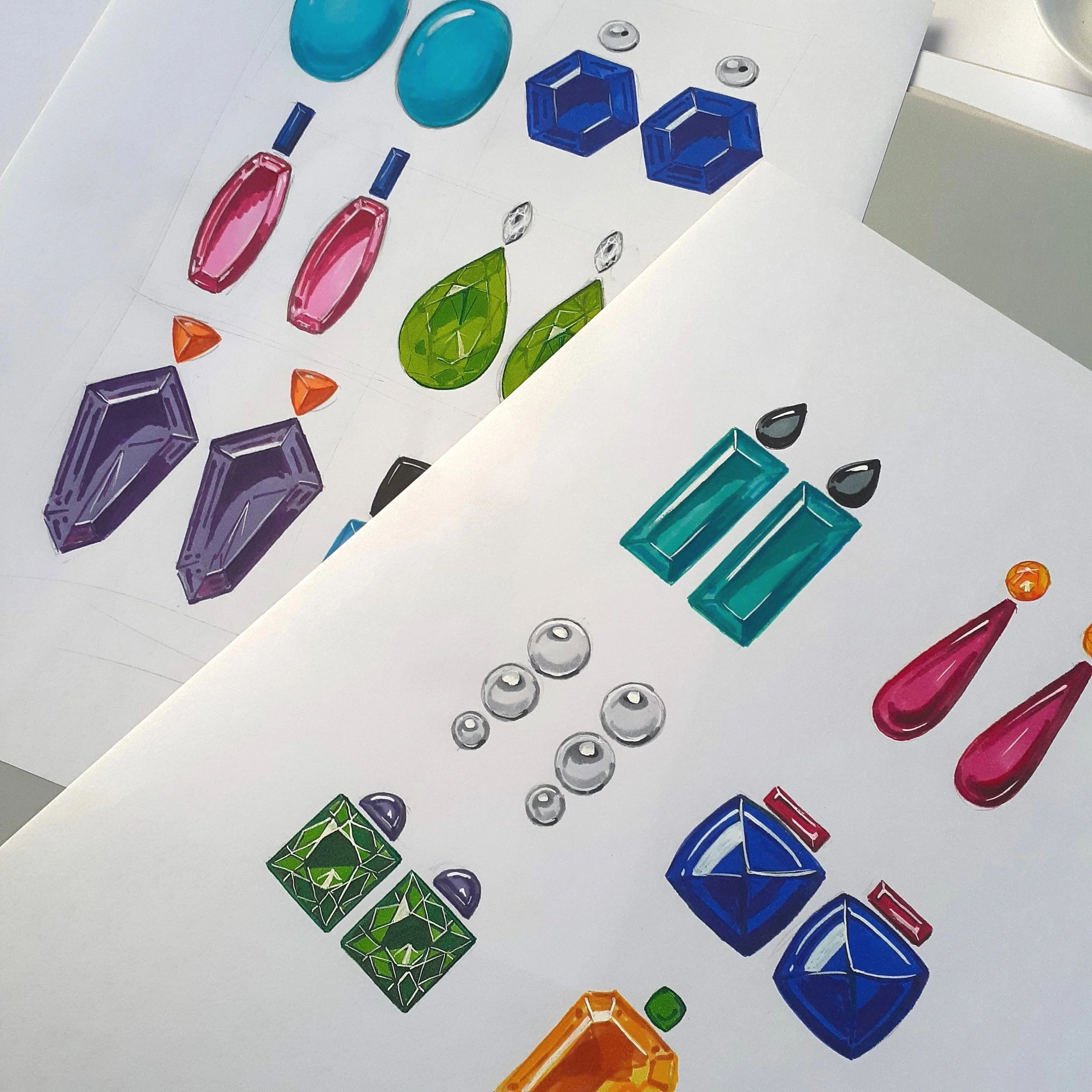
Colour theory is both an art and a science that delves into how we perceive colours, how they interact with each other, and what messages they convey. As a jewellery designer, understanding colour theory can help you tell your client's story, support their style, and develop your brand.
In colour theory, colours are categorised into three groups: primary, secondary, and tertiary colours. The first colour wheel was designed by Sir Isaac Newton in 1666 and is still used by artists and designers today to develop colour harmonies and palettes.
Colour langage when speaking to clients during a design consultation can help to outline direction, make custom pieces meaningful and create a harmonious and considered design options. Understanding colour can help with confident material selection and providing a design that communicates individual details that resonate with clients.
Terms you need to know/ can leverage in a design appointment:
Tints, Tones, and Shades
Tints, tones, and shades are variations of hues, or colours, on the color wheel. A tint is a hue to which white has been added, while a shade is a hue to which black has been added. A tone is a colour to which grey have been added, resulting in a darker hue that appears more subtle and less intense. This language may help when choosing coloured gems or choosing a the best metal to support a gemstone.
Complementary Colours
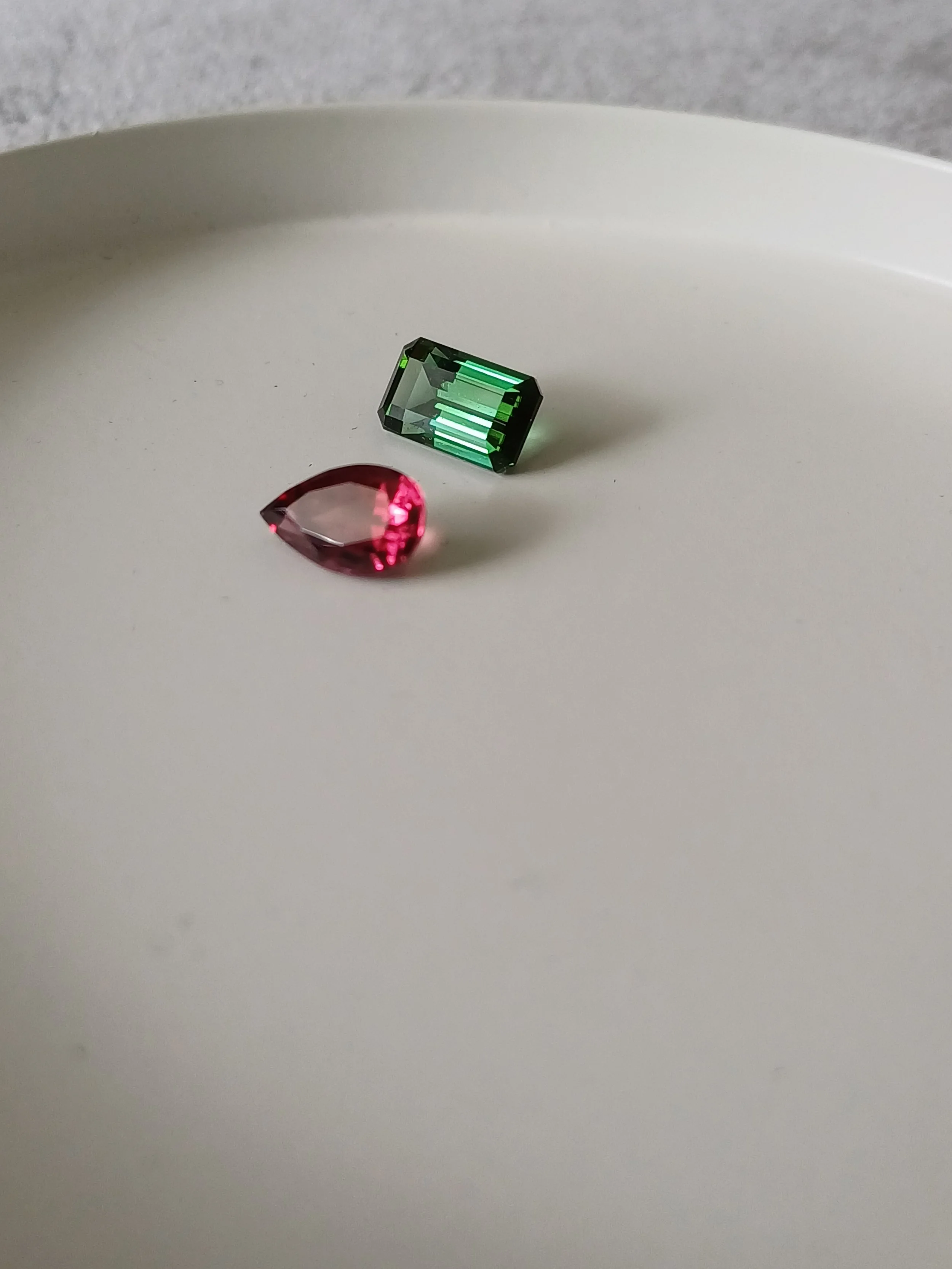
Complementary colours are opposites on the colour wheel, such as red and green. Because of the sharp contrast between these two colours, they can make imagery pop and create a striking visual effect.
Analogous Colours
Analogous colours are colours that sit next to each other on the colour wheel, such as red, orange, and yellow. When creating an analogous colour scheme, one colour will dominate, one will support, and another will accent.
Triadic Colours
Triadic colours are evenly spaced around the colour wheel and tend to be very bright and dynamic. Using a triadic colour scheme in your marketing creates visual contrast and harmony simultaneously, making each item stand out while making the overall image pop.
When is comes to designing a collection or a one-off custom piece understanding colours helps me to make confident decisions around gemstone colour choices and metal combinations.
By understanding colour theory, you can design jewellery that delivers maximum impact and emphasises the emotions that colours evoke in consumers.


